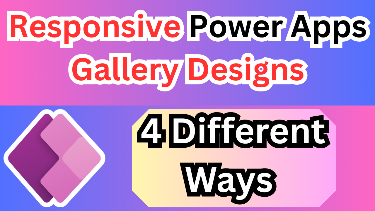
In this article we are exploring 4 different gallery layouts that will help us to display data in all formate.
Learn how to create responsive Power Apps gallery designs using wrap count, containers, slicers, and adaptive layouts for mobile, tablet, and desktop views.
Responsive Power Apps Gallery Designs are below
Default Gallery Layout Power Apps
🔹 Default Gallery Layouts (Responsive Highlights)
By Default Gallery Layout is Responsive it will take all available height and with of your templet and display data.
Below Are Layouts please check.
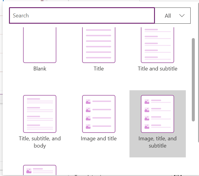
- Title – Single label. Simple and clean for responsive compact lists.
- Title, Subtitle – Two labels. Good for mobile and tablet views, adapts well.
- Title, Subtitle, Body – Three text fields. Responsive height helps manage space.
- Image, Title – Image + title. Auto-resizes nicely on different screens.
- Image, Title, Subtitle – Ideal for people/products. Responsive image sizing supported.
- Image, Title, Subtitle, Body – Rich layout. Use flexible height + auto layout controls for responsive UIs.
Changing Wrap Count Of Gallery Make Power Apps Gallery Responsive
In this scenarios we will chnage the wrap count of gallery dynamically according to screen size,
On Gallery Wrap Count Property Use Below Formula
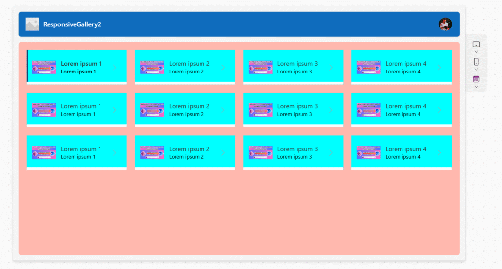
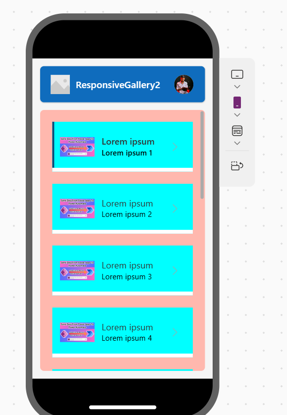
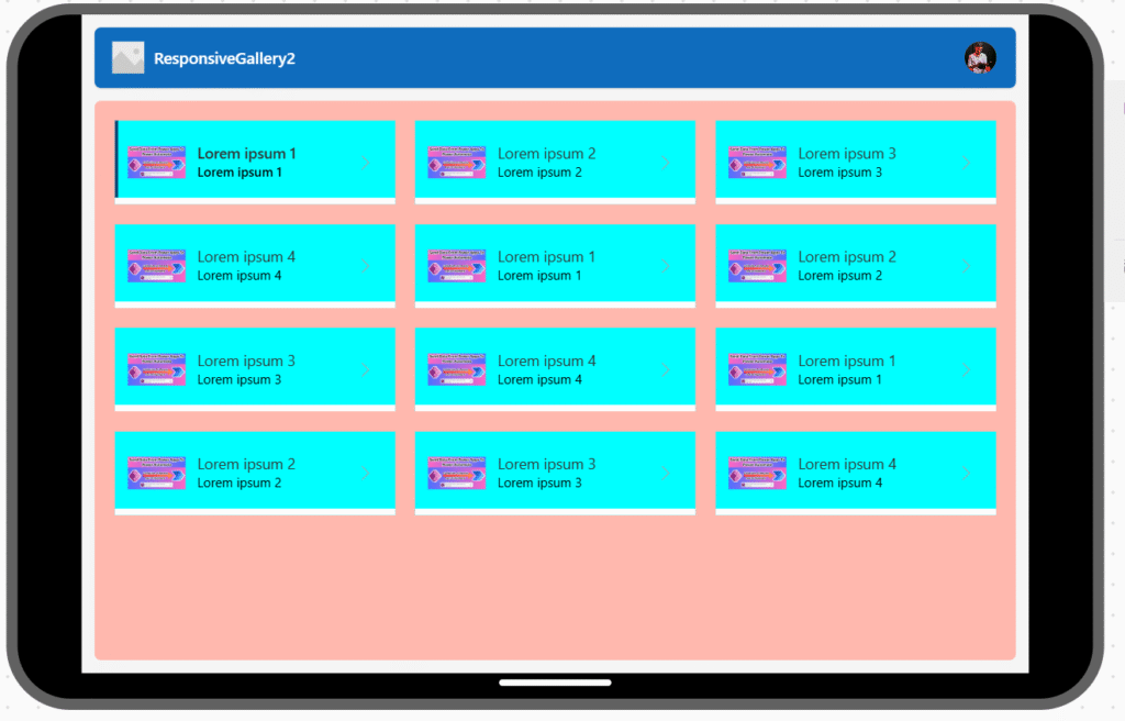
WrapCount: ScreenName.SizeBy using this on mobile you can simple see single templet in row, and in tablet 3 and in laptop it will 4. for more understanding see below imgaes
In Full Screen
In Mobile Phones
In Mobile Phone By Changing Orientation
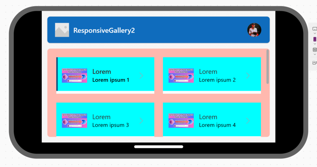
In Tablet
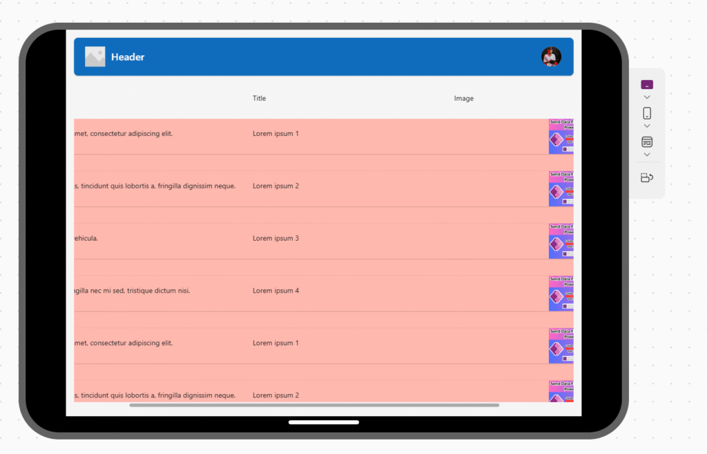
By Using Vertical Container Make Power Apps Responsive Gallery
at the bottom scroll bar is visible🛠️ How to Enable Horizontal Scrolling in a Vertical Container
- Vertical Container Setup:
- OverflowX:
"Scroll"✅ (Allows horizontal scroll) - OverflowY:
"Hidden"or"Auto"(Avoid vertical scroll if not needed)
OverflowX = "Scroll" OverflowY = "Hidden" - OverflowX:
- Child Control Setup:
- Add a horizontal layout inside the vertical container.
- Set the width of that horizontal container greater than the parent vertical container.
Example: plaintextCopyEditWidth = 2000
- Ensure No Width Constraints on Vertical Container:
- If
Wrapis enabled in the child horizontal layout container, turn it off. - Make sure there’s no
WidthFitset to true for horizontal content inside — it must exceed the visible container’s width.
- If
✅ Visual Layout Structure:
mathematicaCopyEditVertical Container (with OverflowX = Scroll)
│
└── Horizontal Container (Width > Vertical Container Width)
    ├── Label
    ├── Button
    ├── Icon
    └── ...
This layout ensures horizontal scroll appears inside the vertical container.
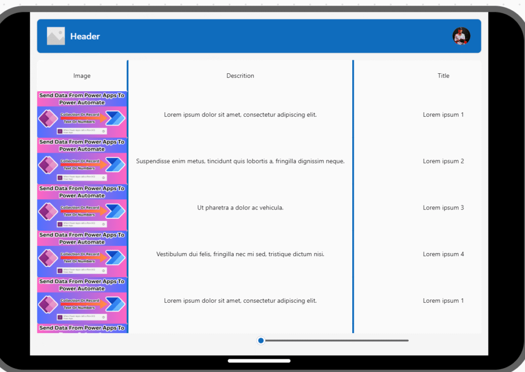
Using Slicer Make Power Apps Gallery Responsive
To make a Power Apps gallery responsive using a slicer (like a slider or dropdown), and keep one column fixed (non-movable) while other columns shift based on slicer value, follow this approach:
To make a Power Apps gallery responsive using a slicer (like a slider or dropdown), and keep one column fixed (non-movable) while other columns shift based on slicer value, follow this approach:
✅ Scenario
- You have a horizontal layout (or a vertical layout but controlling X movement).
- You want:
- Column 1 to stay fixed.
- Column 2, 3, … N to shift right as the slicer value increases.
🔧 Setup
- Add a Slicer Control:
- Use a Slider control called
sldColumnShift. - Set its
Min= 0,Max= 100 (or whatever spacing makes sense).
- Use a Slider control called
- Gallery Layout: Horizontal or vertical flexible layout gallery.
🧮 X Property Logic
Let’s say:
Column1is fixed.Column2,Column3, etc., should move.
Set X property for each label inside the gallery:
🔹 Column 1 (Fixed):
X = 0
🔹 Column 2 (Moves with slicer):
X = 150 + sldColumnShift.Value
🔹 Column 3 (Moves further with more offset):
X = 300 + sldColumnShift.Value
Adjust
150,300, etc., based on base position and width of each column.
🎯 Optional: Use a formula for reusability
If your columns have fixed width colWidth, use:
X = (colIndex * colWidth) + sldColumnShift.Value
Where:
colIndexis a number you assign manually (e.g., Column2 → 1, Column3 → 2).colWidthcan be a global variable or fixed value.
Here’s a short summary of Responsive Power Apps Gallery Designs:
🔹 Default Layouts
Power Apps galleries are responsive by default. Common layouts:
- Title / Title + Subtitle / Title + Subtitle + Body
- Image + Title / Image + Title + Subtitle / Full layout
🔹 Make Gallery Responsive
- Use dynamic WrapCount:
WrapCount = ScreenName.Size
(e.g., 1 item on mobile, 3 on tablet, 4 on laptop)
🔹 Horizontal Scroll in Vertical Container
- Set
OverflowX = "Scroll"on vertical container - Add wide horizontal layout inside (e.g.,
Width = 2000)
🔹 Use Slicer for Dynamic Column Shift
- Fix Column 1:
X = 0 - Shift others:
X = base + sldColumnShift.Value - Formula:
X = (colIndex * colWidth) + sldColumnShift.Value
✨ Thanks for reading! ✨
I hope you found this blog on the Microsoft Power Platform helpful! From Power Apps, Power Automate (Cloud & Desktop), Canvas Apps, Model-driven Apps, Power BI, Power Pages, SharePoint, Dynamics 365 (D365), Azure, and more, I cover a wide range of topics to help you harness these powerful tools. Don’t miss out on future tips, tutorials, and insights—hit that subscribe button to get the latest posts right to your inbox. 💌💬 I’d love to hear your thoughts! Drop a comment below with your questions, ideas, or feedback—let’s get the conversation started!🔗 Let’s connect and grow together!
Follow me, Ravindra Jadhav, on your favorite platforms for even more content and updates on Microsoft Power Platform and related technologies:
💼 LinkedIn – Let’s network and share ideas!
💻 GitHub – Explore my projects and code.
🐦 Twitter – Stay updated with quick tips and industry news.
📺 YouTube – Watch tutorials and deep dives on Power Platform, Power Apps, Power Automate, and more! Let’s build something amazing together with Power Platform and Azure! 🚀
Responsive Power Apps Gallery Designs
Responsive Power Apps Gallery Designs
Responsive Power Apps Gallery Designs
Responsive Power Apps Gallery Designs
- Top Techniques to Make Power Apps Galleries Fully Responsive
- Responsive Power Apps Gallery Layouts Explained
- Power Apps Gallery: Dynamic Wrap Count & Layout Tricks
- Create Mobile-Friendly Power Apps Galleries Easily
- How to Use Containers for Scrollable Power Apps Galleries
- Building Adaptive UI in Power Apps with Gallery Controls
- Power Apps Gallery Designs for All Screen Sizes
- Make Power Apps Galleries Responsive with Slicers & Containers
- Auto-Adjusting Gallery Wraps in Power Apps: A Quick Guide
- Responsive Gallery Layouts with Images and Text in Power Apps
Responsive Power Apps Gallery Layouts for All Devices
Responsive Power Apps Gallery
Power Apps Gallery Layout
Power Apps Responsive Design
Power Apps Wrap Count
Power Apps Container Scroll
Power Apps UI Design
Power Apps Horizontal Scroll
Power Apps Gallery Slider
Power Apps Mobile Layout
Adaptive Gallery in Power Apps
PowerApps #PowerPlatform #ResponsiveDesign #LowCode #CanvasApp #GalleryLayout #PowerAppsTips #MicrosoftPowerApps #WrapCount #UIDesign
Responsive Power Apps Gallery Designs
Responsive Power Apps Gallery Designs
Responsive Power Apps Gallery Designs
Responsive Power Apps Gallery Designs
Responsive Power Apps Gallery Designs
Responsive Power Apps Gallery Designs